
Jakylla
My main account, for mainly English content
Alternative for mostly French content: @Jakylla@jlai.lu
- 0 Posts
- 11 Comments

 88·6 months ago
“No” is the most accurate I could ever have imagined for Inkjet Printers
inplace sort be like:
def sort(list: list):
    list.clear()
HTML: You are not a nerd
Edit: OH MY GOD what did you just share !!!
// Move to the right
BAM! I got that div centered on this display!
$ rm -rf /
Removing /etc/passwords...
~ WITH XXXXX ANTIVIR, PROTECT YOUR PASSWORDS FOR ONLY 5.99$ PER MONTH ~
Removing /home/user...
~ WITH XXX VPN, ACCESS ALL YOUR CONTENT ONLINE FROM ANY COUNTRY IN THE WORLD, 19.99$ PER YEAR FOR NEW SUBSCRIPTIONS ~
Removing /bin/bash...
~ DO YOU WANT A BIGGER D ? TAKE XXXX PILLS, 99.9% SUCCESS ~
...
 1·1 year ago
So nice ! I was trying to make one to expand the page and use this 40% left-right margin on my screens, Thank you !
Here are my personal adaptations:
- Commented font-size for titles: I didn’t like having them as small as the text
CSS code
/* post title font size*/
.h5, h5 {
    /*font-size: 1rem !important;*/
    margin-bottom: 0.1rem !important;
}
.
- Added a class for posts without image or links to have a thumbnail without the gray background, to dissociate them from links (that are from my point of view, too similar looking to text only posts)- Also changed how I display images in thumbnail (I prefer to see the whole image resized down with no crop, even if hardly anything may be readable on the thumbnail)
CSS code
.thumbnail {
    object-fit: scale-down; /* instead of "cover" */
    background-color: #333;
}

/* Remove gray background for only-messages posts thumbnails */
.post-media a[href^="/post/"] .thumbnail {
    background-color: unset !important;
}
Screenshot
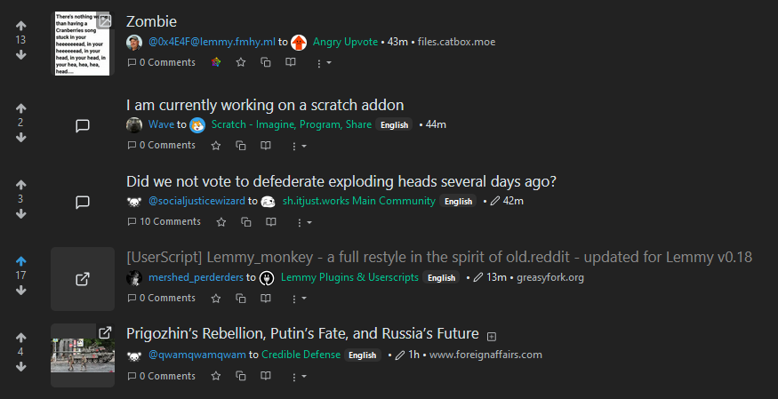
(Notice the visible difference between the link and the post without link)
Don’t know why he’s so annoyed, maybe you didn’t throw his database, but still something happened, I’m pretty sure…

XKCD Source (if we are in the universe where you don’t know it yet): https://xkcd.com/327/
And if you want to understand more about it, check the explain XKCD wiki: https://www.explainxkcd.com/wiki/index.php/327:_Exploits_of_a_Mom
Not sure CrowdStrike runs on npm, but still ruined it all for sure